Free tools Windows power users keep installed
One-click scans. No signup required.
Make the registration flow and venue page understandable without sight, a mouse, or guesswork. Use standard HTML labels and grouping, explain requirements in text, expose errors and completion status, divide long forms into logical steps, and publish specific information about entrances, routes, rooms, bathrooms, and accommodation requests. Use WCAG Level AA as the website benchmark, then verify the actual journey with keyboard and screen-reader testing.
What an accessible event journey must let people do
An attendee using a screen reader should be able to find the registration form, understand what every control asks for, complete it in a logical order, recover from mistakes, and receive confirmation that registration succeeded. The same person should be able to determine how to enter the venue, move between event spaces, use bathrooms, and request an accommodation that is not already described.
Accessibility is not established by a generic statement such as “accessible venue.” The page needs concrete information and a communication route for questions. W3C’s Making Events Accessible checklist recommends describing accessible entrances and routes, the accessibility of meeting rooms and bathrooms, and a way for participants to communicate requirements. It also recommends allowing speakers and participants to review rooms in advance when that would help with seating or positioning.
For the event website, W3C recommends that HTML material such as a conference website meet WCAG, at least Level AA. The WCAG technical standard contains the normative requirements. W3C tutorials and techniques explain implementation, but those supporting resources do not create or change conformance requirements.
What’s actually slowing this PC down?
Pick the symptom - the matching free tool is one click away.
#1 Best Overall

- HD streaming made simple: With America’s number 1 TV streaming platform,* exploring popular apps—plus tons of free movies, shows, and live TV—is as easy as it is fun. *Based on hours streamed—Hypothesis Group
- Compact without compromises: The sleek design of Roku Streaming Stick won’t block neighboring HDMI ports, and it even powers from your TV alone, plugging into the back and staying out of sight. No wall outlet, no extra cords, no clutter.
- No more juggling remotes: Power up your TV, adjust the volume, and control your Roku device with one remote. Use your voice to quickly search, play entertainment, and more.
- Shows on the go: Take your TV to-go when traveling—without needing to log into someone else’s device.
- TV, simplified: With setup that only takes minutes, a simple-to-navigate Home Screen, and an uncluttered remote control that does all you need—Roku makes it easier to watch the TV you love.
Build the registration form on semantic HTML
Screen readers derive names, relationships, roles, and state from the document structure and accessibility information exposed by the browser. A visible caption beside a control is not sufficient if the relationship is not programmatically available. Use native HTML first; add ARIA only when native elements do not provide the required semantics.
Give every control a programmatic label
Associate each <label> with its control using matching for and id values. The label should say what information is wanted, not merely repeat a database field name. Do not rely on placeholder text as the only name: placeholders disappear when someone types and are not a dependable replacement for labels.
<label for="email">Email address</label>
<input id="email" name="email" type="email" autocomplete="email" required>
The label is read with the control, and clicking or tapping it enlarges the target area. Keep the label visible when the field contains a value. If a field needs more explanation, connect that explanation with aria-describedby while keeping the main label intact.
<label for="dietary">Dietary requirements</label>
<textarea id="dietary" name="dietary" aria-describedby="dietary-help"></textarea>
<p id="dietary-help">List allergies or dietary restrictions. You may write “none.”</p>
Use one clear label per control. If a design puts a question in a card heading or table cell, still provide an explicit label that is programmatically associated with the input.
Do these 3 things before closing this tab:
1Clear out junk files and repair common Windows errors2Fix the driver behind crashes, sound loss and screen glitches3Repair Windows errors before they cause bigger problemsGroup related choices with fieldsets and legends
Radio buttons and related checkboxes often share a question. A screen-reader user needs that shared context before hearing each option. Wrap the set in <fieldset> and put the question in <legend>.
<fieldset>
  <legend>Which days will you attend?</legend>
  <label><input type="checkbox" name="days" value="day-1"> Day 1</label>
  <label><input type="checkbox" name="days" value="day-2"> Day 2</label>
</fieldset>
Use a separate fieldset when a second group has a different question. For example, “Choose a ticket type” and “Choose a payment method” should not share one legend. Grouping also helps people who navigate by headings, form controls, or landmarks rather than reading every line.
Ask only for information needed to register
Every additional question increases the time and cognitive load of the process. W3C’s Forms Tutorial advises keeping the form focused on information needed to complete registration. Explain why an unusual question is required, and make optional fields visibly optional rather than forcing users to infer the rule.
Use a consistent required-field convention. For example, put “(required)” in the visible label and retain the HTML required attribute so the browser can expose the state. Do not mark a field required only with a color or an asterisk whose meaning is explained somewhere else.
Rank #2

- Ultra-speedy streaming: Roku Ultra is 30% faster than any other Roku player, delivering a lightning-fast interface and apps that launch in a snap.
- Cinematic streaming: This TV streaming device brings the movie theater to your living room with spectacular 4K, HDR10+, and Dolby Vision picture alongside immersive Dolby Atmos audio.
- The ultimate Roku remote: The rechargeable Roku Voice Remote Pro offers backlit buttons, hands-free voice controls, and a lost remote finder.
- No more fumbling in the dark: See what you’re pressing with backlit buttons.
- Say goodbye to batteries: Keep your remote powered for months on a single charge.
<label for="name">Full name (required)</label>
<input id="name" name="name" autocomplete="name" required>
Instructions belong near the field or group they describe. State accepted formats, units, or unusual interactions before submission. For a phone number, explain the expected country format if the event serves more than one region; do not make users discover formatting rules from an error after a failed attempt.
Make errors and status changes available in text
A failed submission should identify the relevant field and explain how to fix it in text. Color may emphasize the problem, but it must not be the only cue. The W3C guidance on Error Identification treats an error as information that needs to be conveyed in a way users can perceive and understand.
Identify the field and the problem
Put the specific message near the control and connect it with aria-describedby. Keep the label and error separate so the user hears both the field name and the correction.
<label for="email">Email address (required)</label>
<input id="email" name="email" type="email"
       aria-invalid="true" aria-describedby="email-error" required>
<p id="email-error">Enter an email address in the format [email protected].</p>
When several fields fail, provide a summary at the top that lists each problem and links to the corresponding control. Move focus to the summary or another predictable location after submission so a screen-reader user is not left at the top of an unchanged page with no explanation.
PC Slower Than It Used to Be?
A free scan shows the junk files, broken settings and background clutter dragging Windows down - then fixes them in one click.Free scan · Windows 10 & 11Crashes, No Sound, or Screen Glitches?
Random freezes, missing sound and display glitches usually trace back to one bad driver. Find and replace yours safely.Free scan · under a minute<div id="form-errors" role="alert" tabindex="-1">
<h2>There are 2 problems with your registration</h2>
<ul>
<li><a href="#email">Enter a valid email address.</a></li>
<li><a href="#days">Choose at least one attendance day.</a></li>
</ul>
</div>Use text that tells users what to do next. “Invalid input” is not actionable; “Enter the date as DD/MM/YYYY” is. Preserve valid values when validation fails so people do not have to re-enter information.
Announce successful completion
Success needs an equivalent text status. After registration, provide a clear heading or message that confirms completion and includes practical next steps, such as how to retrieve a ticket or contact the organizer. If the page updates without a full navigation, expose the change with an appropriate live-region pattern and ensure keyboard focus moves predictably.
Do not rely on a green banner, an animation, or a redirect with no meaningful title. The user should be able to identify that registration is complete when navigating by headings or reading the page from the point where focus lands.
Give long forms a logical, perceivable flow
Long registration processes should be divided into meaningful stages rather than one uninterrupted page. Typical stages might separate attendee details, attendance choices, access requirements, and payment, but the divisions should reflect the information needed for your event.
Explain where the person is
Each step needs a distinct heading and an indication of progress, such as “Step 2 of 4: Access requirements.” State which steps are complete and which remain. A progress indicator should be textually understandable; a bar whose status is communicated only by width or color is not enough.
Rank #3

- 4K streaming made simple:With America’s number 1 TV streaming platform,* exploring popular apps—plus tons of free movies, shows, and live TV—is as easy as it is fun. *Based on hours streamed—Hypothesis Group
- 4K picture quality: With Roku Streaming Stick Plus, watch your favorites with brilliant 4K picture and vivid HDR color.
- Compact without compromises: Our sleek design won’t block neighboring HDMI ports, and it even powers from your TV alone, plugging into the back and staying out of sight. No wall outlet, no extra cords, no clutter.
- No more juggling remotes: Power up your TV, adjust the volume, and control your Roku device with one remote. Use your voice to quickly search, play entertainment, and more.
- Shows on the go: Take your TV to-go when traveling—without needing to log into someone else’s device.
Use ordinary links or buttons with descriptive names. “Next: access requirements” is more informative than four identical “Continue” buttons when users review their history or navigate by controls. Keep back navigation available without discarding entered data.
Keep timing from creating an avoidable barrier
W3C advises that forms should not be timed where possible. If a limit is necessary, users should be able to turn it off or extend it, subject to stated exceptions such as essential timing or a live event. Tell users about the limit before it starts, announce warnings in text, and provide a direct way to request more time when the design permits it.
A payment-session timeout, for example, should not silently erase a completed registration. Save information safely between stages where appropriate, and explain what will happen when time expires. Do not add a countdown merely because the registration system offers one by default.
Quick wins for a faster PC:
Clear out junk files and repair common Windows errorsFree Scan →Scan for outdated or missing drivers - takes under a minuteDriver Scan →Publish venue information as an access map in words
The venue page should answer the practical questions an attendee has before leaving home. Describe the specific route, not just a compliance label. If different entrances have different conditions, name each one and explain when it is open.
Describe entrances and routes
State which entrance is step-free, where an elevator or ramp is located, and how a person gets from the entrance to registration, meeting rooms, stages, quiet areas, and other event spaces. Include route connections between rooms when attendees may need to change floors or buildings. If a route requires a security desk, intercom, or staff assistance, say so and provide the procedure.
Use plain directional language and stable landmarks. A useful description identifies the entrance, the path, and the destination rather than saying “the venue is accessible.” If access differs by time, event day, or room, publish those conditions next to the relevant route.
Report room and stage access separately
Indicate whether each meeting room is reachable by the accessible route and whether the stage or presentation area can be reached. Explain any seating constraints, narrow aisles, platform access issues, or positioning arrangements that participants and speakers should know in advance. Do not imply that access to the building guarantees access to every room.
W3C’s event checklist recommends allowing speakers and participants to review rooms in advance where useful. Offer a practical way to arrange that review, and invite people to request a suitable seat or position before the event rather than making them negotiate it at the door.
Rank #4
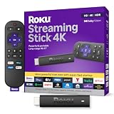
- Stunning 4K and Dolby Vision streaming made simple: With America’s number 1 TV streaming platform,* exploring popular apps—plus tons of free movies, shows, and live TV—is as easy as it is fun. *Based on hours streamed—Hypothesis Group
- Breathtaking picture quality: Stunningly sharp 4K picture brings out rich detail in your entertainment with four times the resolution of HD. Watch as colors pop off your screen and enjoy lifelike clarity with Dolby Vision and HDR10+.
- Seamless streaming for any room: With Roku Streaming Stick 4K, watch your favorite entertainment on any TV in the house, even in rooms farther from your router thanks to the long-range Wi-Fi receiver.
- Shows on the go: Take your TV to-go when traveling—without needing to log into someone else’s device.
- Compact without compromises: Our sleek design won’t block neighboring HDMI ports, so you can switch from streaming to gaming with ease. Plus, it’s designed to stay hidden behind your TV, keeping wires neatly out of sight
Describe bathrooms and other essential facilities
State whether accessible bathrooms are available, where they are in relation to the event rooms, and whether the route to them is step-free. Include other facilities that materially affect participation, such as a quiet room or a location for assistance, only when they actually exist and are available during the event. Avoid vague promises that do not tell someone what to expect.
Provide an accommodation-request route
Published details cannot anticipate every requirement. Give attendees a clear contact or request route and invite them to describe specific needs through registration or another communication channel. The request path should be easy to find on both the registration page and the venue information page.
Explain what information helps the organizer respond, such as the event session, date, or type of assistance, without demanding unnecessary medical details. State when requests should be submitted if there is a practical deadline, and identify an alternative contact method if the primary channel is inaccessible.
The Tool Desk
Outbyte PC Repair FREERepair Windows errors before they cause bigger problemsFix Now →Outbyte Driver Updater FREEFix the driver behind crashes, sound loss and screen glitchesFind Drivers →When a person submits a request, provide a text confirmation that it was received and explain how follow-up will occur. Internally, assign responsibility for reviewing requests and sharing only the information staff need to deliver the accommodation. The public page should describe the route and available features without exposing anyone’s personal information.
Write accessible instructions and page structure
Use a heading hierarchy that reflects the page’s information architecture: one page title, then headings for registration, access routes, rooms, bathrooms, and requests, with subheadings for individual spaces or steps. Headings should describe the content that follows, not act as decorative labels.
Keep instructions adjacent to the control or route they describe. Define abbreviations and avoid relying on visual references such as “click the green button on the right.” Link text should identify its destination. If a downloadable map is provided, repeat its essential route information in HTML so users are not required to interpret an image or document.
Use tables only when attendees need to compare structured facts, such as room, floor, accessible entrance, and bathroom location. Give the table a caption and header cells so the relationships remain understandable when read linearly.
Review the registration and venue experience before publishing
A checklist is a starting point, not proof that a site or venue is fully accessible. Review the actual path people will use, including validation, payment or confirmation, and the route from the venue entrance to each event space.
Best Value

- The Google TV Streamer (4K) delivers your favorite entertainment quickly, easily, and personalized to you[1,2]
- HDMI 2.1 cable required (sold separately)
- See movies and TV shows from all your services right from your home screen[2]; and find new things to watch with tailored recommendations for everyone in your home based on their interests and viewing habits
- Watch live TV and access over 800 free channels from Pluto TV, Tubi, and more[3]; if you find an interesting show or movie on your TV, mobile app, or Google search, you can easily add it to your watchlist, so it’s ready when you are[2]
- Up to 4K HDR with Dolby Vision delivers captivating, true-to-life detail[4]; and you can connect speakers that support Dolby Atmos for more immersive 3D sound
Keyboard review
- Reach every link, field, checkbox, radio button, menu, dialog, and submit control with the keyboard.
- Keep a visible focus indicator and ensure focus follows a logical order.
- Confirm that a person can open, complete, close, and recover from every interactive step without a pointer.
- Check that focus is placed sensibly after an error, a step transition, a dialog, and successful registration.
Screen-reader review
- Navigate by headings and form controls to verify that page structure is meaningful.
- Listen to each label, required state, instruction, group legend, and error message.
- Submit incomplete and incorrectly formatted forms and confirm that the problem and remedy are announced in text.
- Confirm that progress, time warnings, confirmation, and dynamically inserted content are perceivable.
- Read the venue page linearly and by headings to ensure route and facility details do not depend on visual layout.
Test with the browser and assistive technology combinations your audience is likely to use, and include people with disabilities in review when possible. The W3C documents explain the requirements and implementation concepts, but neither a checklist nor a tutorial substitutes for evaluating the finished journey.
Use a decision checklist for organizers and platform teams
| Area | Questions to answer before launch | Evidence to retain |
|---|---|---|
| Names and grouping | Does every control have a programmatic label? Do related choices have a fieldset and legend? | Rendered HTML review and screen-reader output |
| Instructions | Are required fields, formats, and unusual interactions explained beside the relevant control? | Content review with representative completed forms |
| Errors | Does each failed field have a text explanation and a specific correction? Is color only supplementary? | Keyboard and screen-reader error scenarios |
| Status | Can users tell which step they are on, what remains, and whether registration succeeded? | Multi-step and confirmation-path recordings or notes |
| Timing | Is a time limit necessary? If so, can it be removed or extended within the applicable exception? | Timeout behavior and extension procedure |
| Venue routes | Are entrances, routes between spaces, rooms, stages, and bathrooms described specifically? | Current venue access sheet verified by the venue |
| Requests | Can attendees submit requirements through a clearly identified channel and receive confirmation? | Request form or contact workflow and response owner |
When a registration platform cannot expose labels, grouping, status, or error text in the way your design requires, treat that as a platform-selection or implementation problem. Compare approaches on the capabilities in this table and test the complete flow; no particular vendor is established here as conforming.
Common failures and practical fixes
“The labels are visible, so the form is accessible.”
A label that is not associated in markup may not be announced with its control. Inspect the rendered relationship, use matching identifiers, and repeat the test with a screen reader.
“The venue is accessible” with no route details
This forces attendees to guess whether the entrance, room, stage, and bathroom are usable. Replace the general claim with named entrances, route descriptions, room-by-room information, and a request channel.
Errors shown only in red
Color does not identify the field or explain the correction. Add text beside the field, mark the invalid state programmatically, and provide a linked summary when several errors occur.
A long single-page form with no progress
Break the process into logical stages, label each stage, preserve entered data, and announce transitions. If the form is already short and coherent, do not split it into arbitrary screens.
Silent success or an unexpected timeout
Expose completion in a heading or announced status and explain next steps. Remove unnecessary time limits; where a limit is essential, explain it early and provide the permitted extension or disable option.
Recommended Free Tools
Set an ongoing ownership process
Accessibility details change when a room, entrance, schedule, or registration workflow changes. Assign an owner to verify the venue information before each event and another to review the live registration path after updates. Record the date of the last verification and the conditions it covered, without presenting that record as a guarantee of universal access.
Train registration and event staff to recognize accommodation requests, preserve privacy, and escalate questions they cannot answer. Keep the public contact route active through the event period, including during setup and on event days. After the event, use reported barriers to improve the next registration form and venue description.
What “accessible” should mean in your public wording
Describe concrete capabilities and limits: “The north entrance is step-free; the lift connects the lobby to rooms 201–204; an accessible bathroom is on level two; contact the registration team for seating or other requirements.” Avoid an unsupported statement that the entire event is “fully accessible.” Specific information helps attendees make an informed decision and gives them a route to raise needs the organizer has not anticipated.
Apply WCAG as the technical baseline for the website, use W3C’s event guidance for the venue and participant experience, and validate the actual registration journey with keyboard and screen-reader users. That combination turns accessibility from a label into usable information and a workable process.
Quick Recap
Product prices and availability are accurate as of the date/time indicated and are subject to change. Any price and availability information displayed on Amazon at the time of purchase will apply.






Say something about this film